Creation of a unique Logo for Marcom LA’s new office.
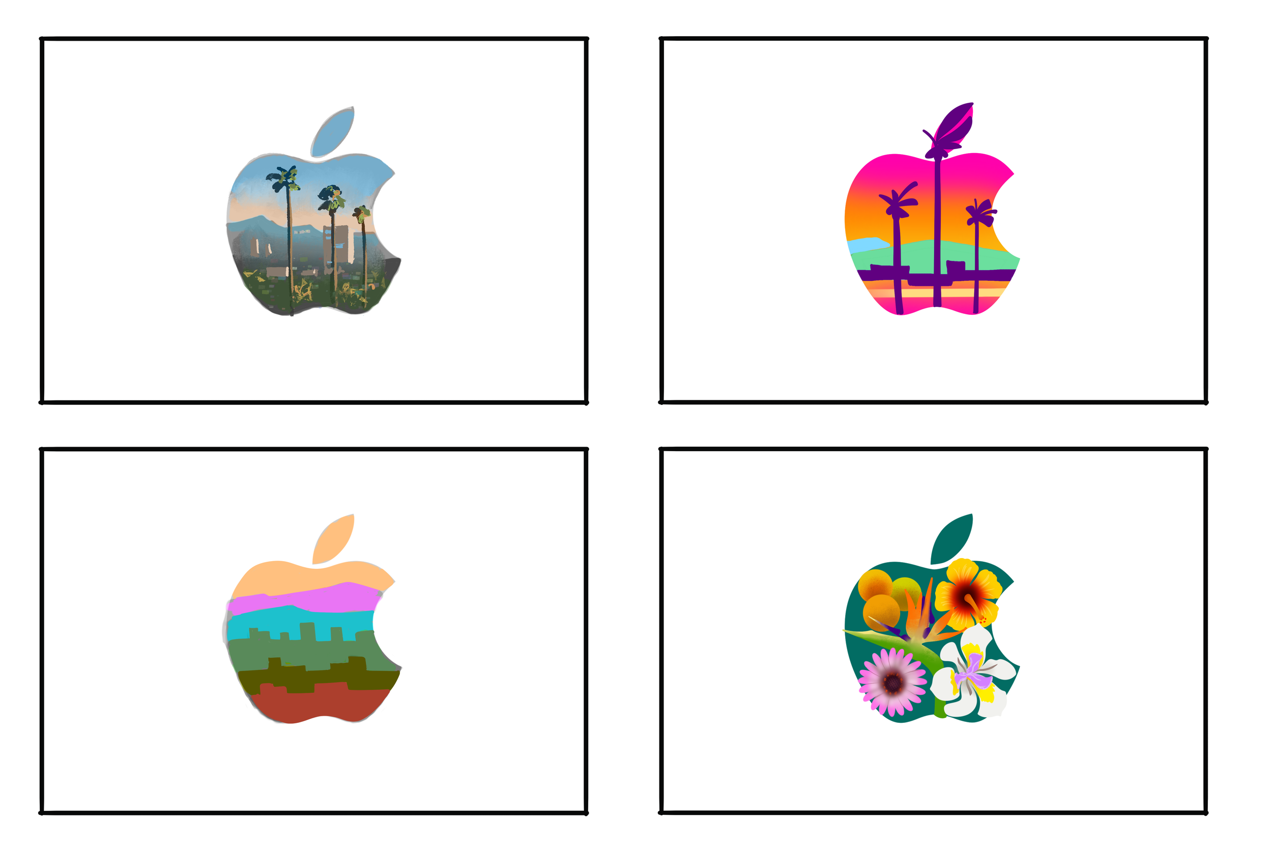
The team at Marcom LA had received the news that we would be moving into a new office space. The direction was to craft our own Apple Logo that captured the essence of Los Angeles, but at the same time felt quintessentially Apple. What made the project even more challenging was we had to turn it around in about 4 days.

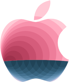
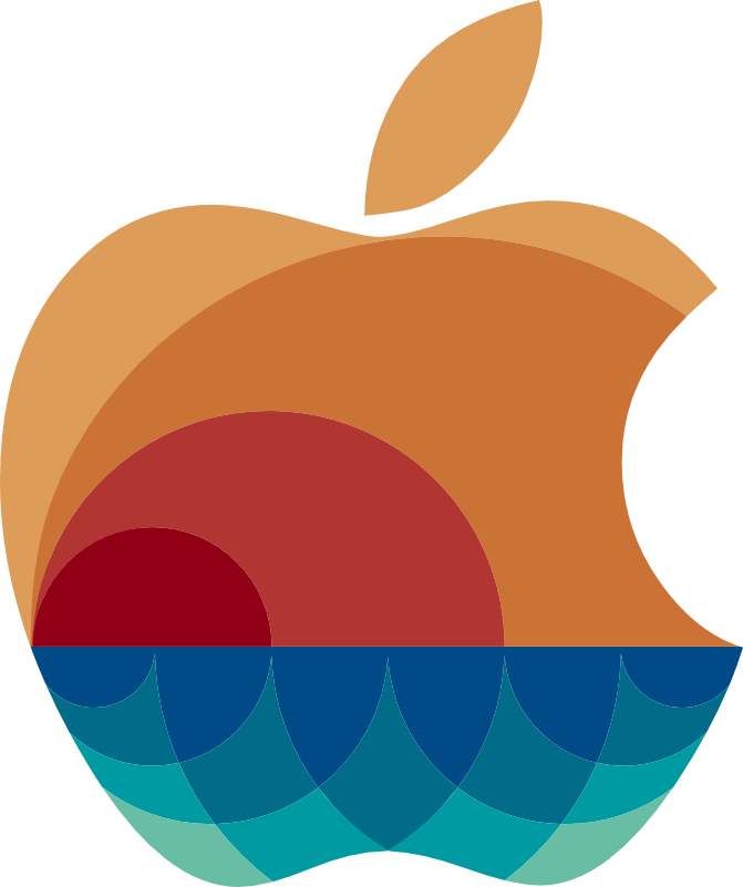
A design that symbolizes what we do.
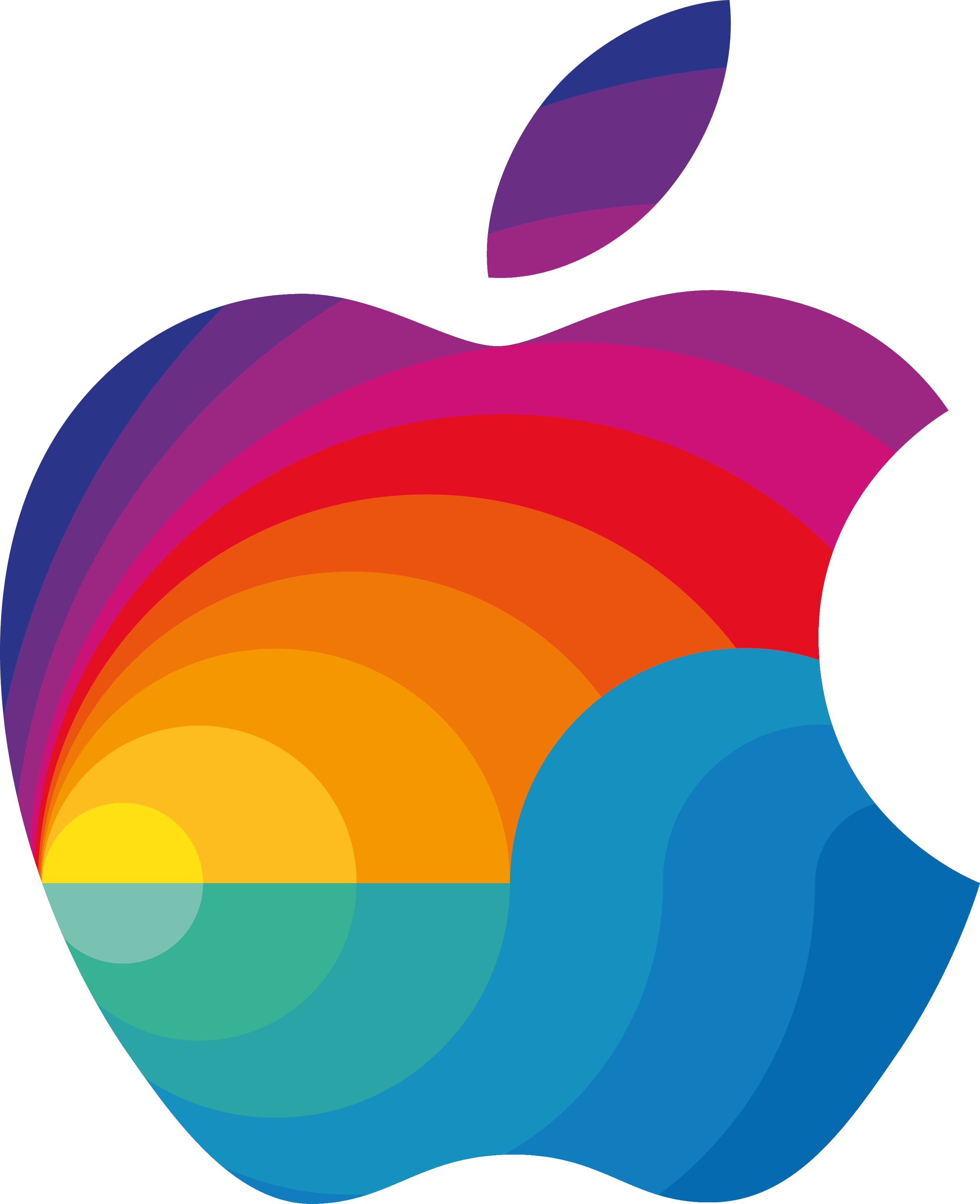
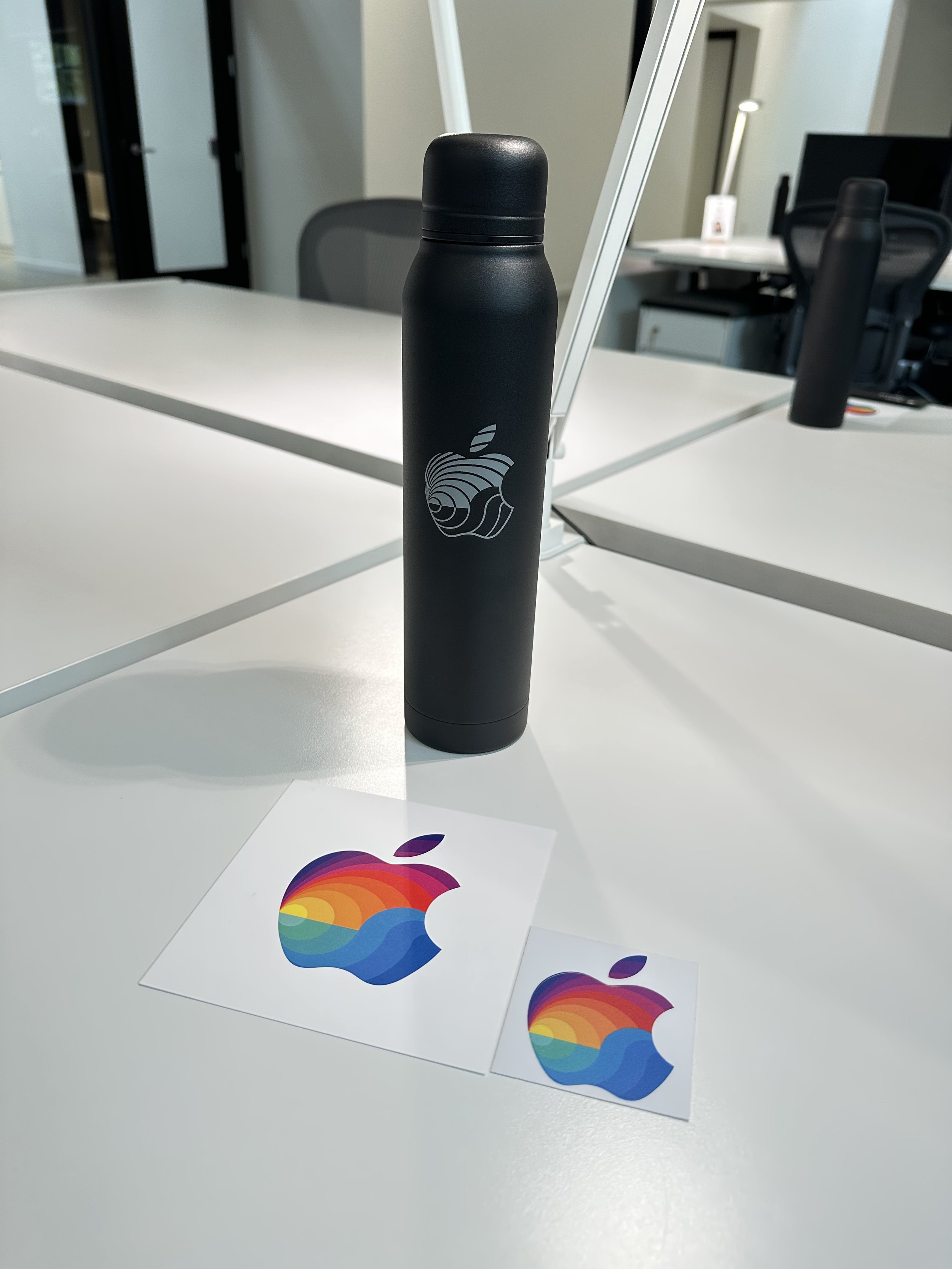
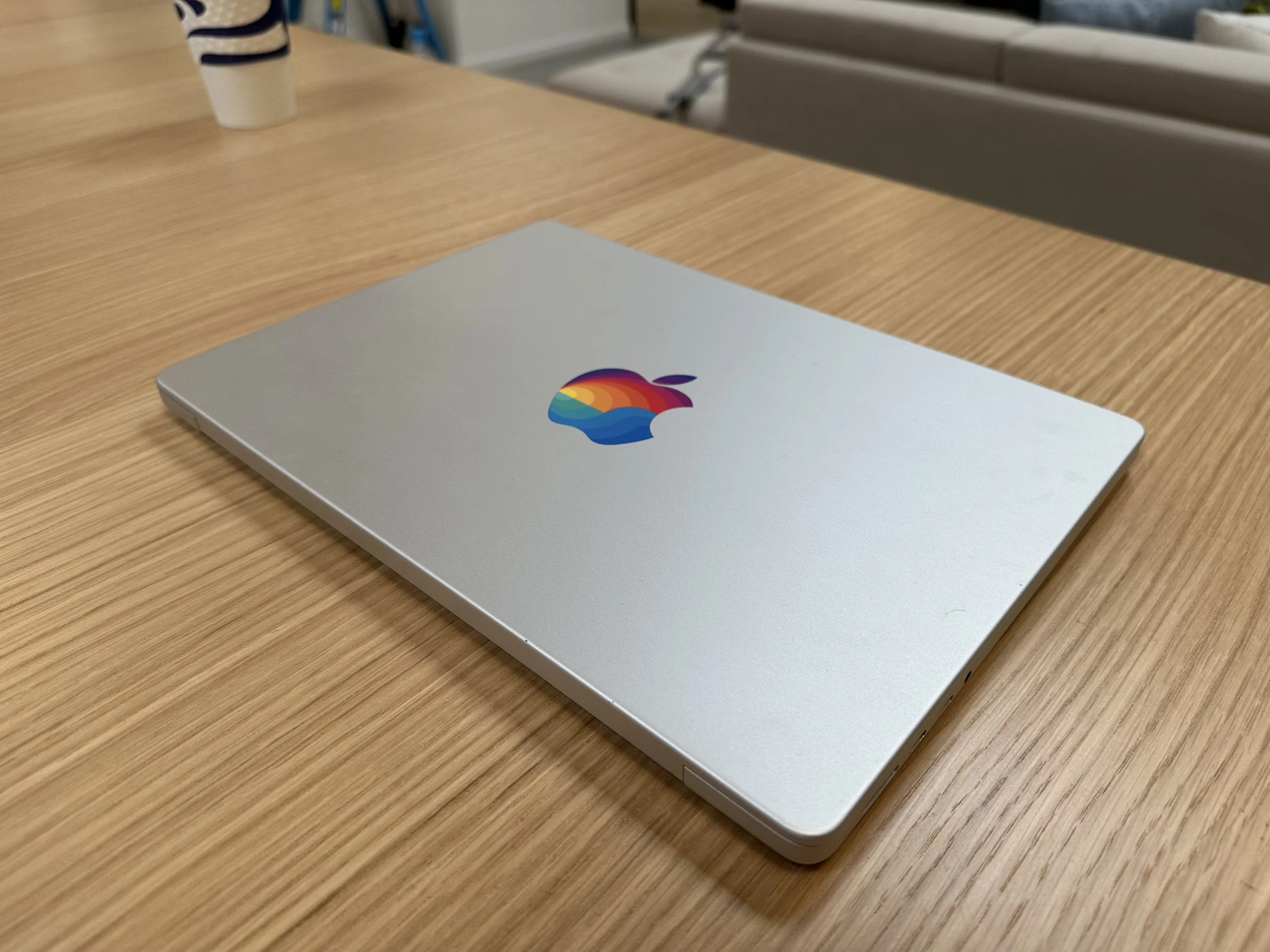
The design that ended up getting pushed though leaned into the idea of a “signal” because of Marcom LA’s ultimate job of telling the story of Apple Services. This could be represented as ‘rays’, or ‘waves’ also providing the opportunity to showcase the coastal aspects of Los Angeles sunshine and ocean.
The resulting design is dynamic, yet beautifully simple.
Implementing the feedback given, and building on the initial concept, a final design emerged. This design was ultimately selected from among over 15 other designs. It now represents Marcom LA, and brings unity and identity to a important part of Apple’s marketing ecosystem.
