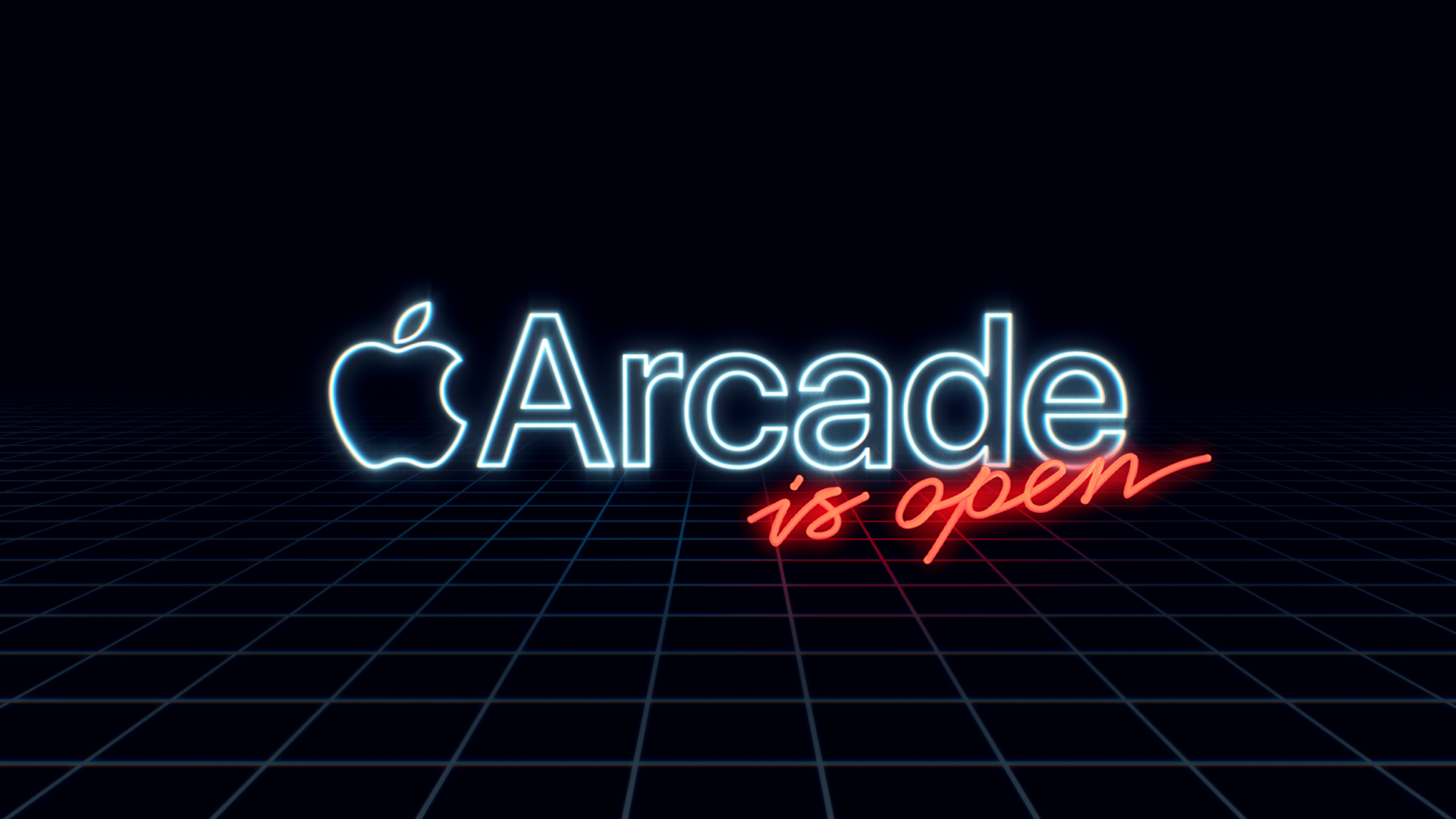
Adaptation of Initial Concept:
The original art direction was that that had the feel of a retro arcade. The key word mark would appear as though made from neon signage tubing. The original mockup used a font that had the right attitude, but was not original and had some readability issues, especially when used in so many different applications.
Creation of Bespoke Font Sets
I spearheaded the creation of new original font sets that had a similar attitude, but were scalable in the principles of readability and localization. The font needed to be clarified and simplified without losing the 1980s attitude. It also needed to look as though it could actually be made out of neon tubing.
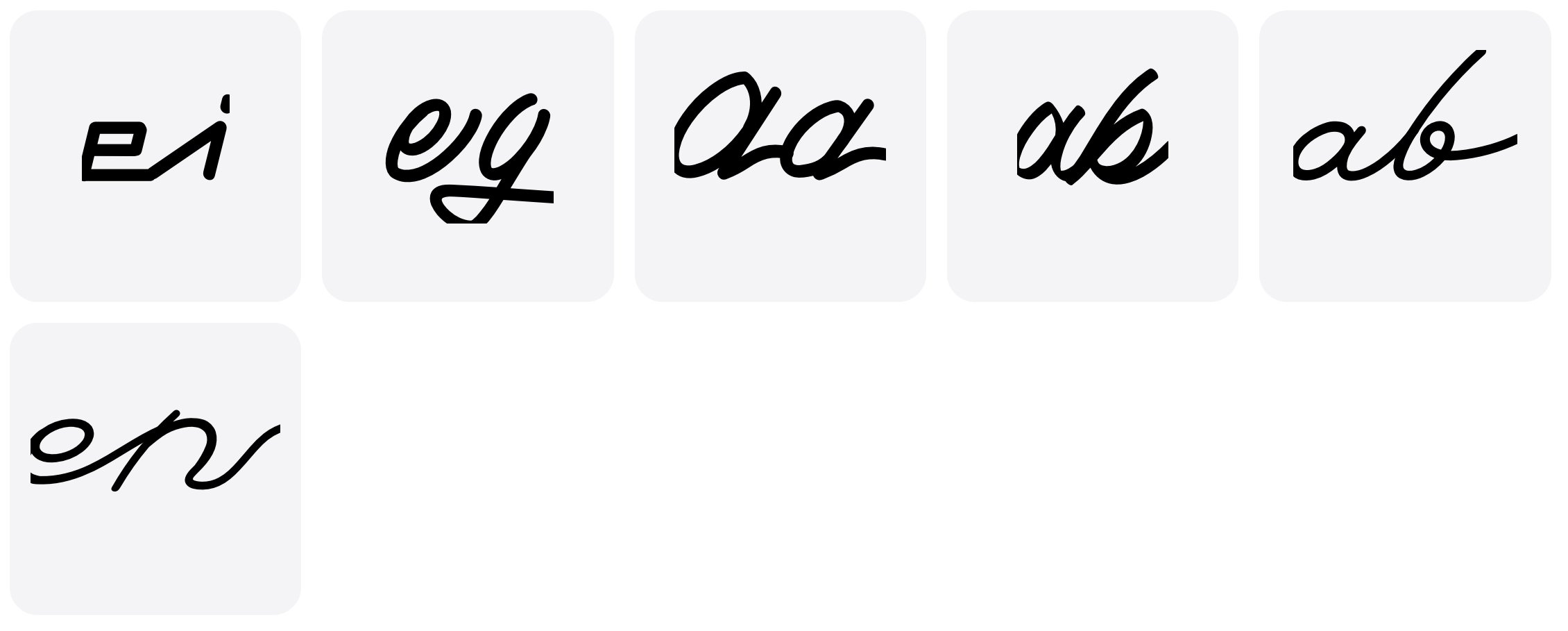

Readability Considerations
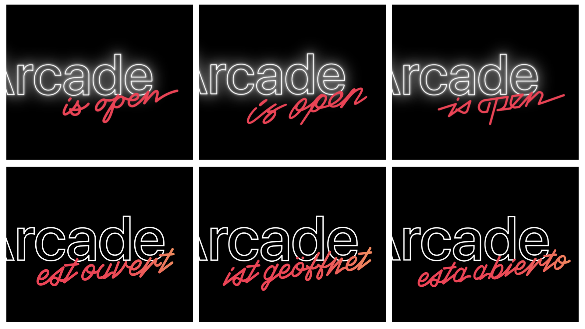
Working through multiple iterations of pressure testing the script evolved into something that retained the original attitude, but could be adapted to work in various settings, and even in different languages. The examples seen on the bottom here (although probably not accurate translations) show my original font design.
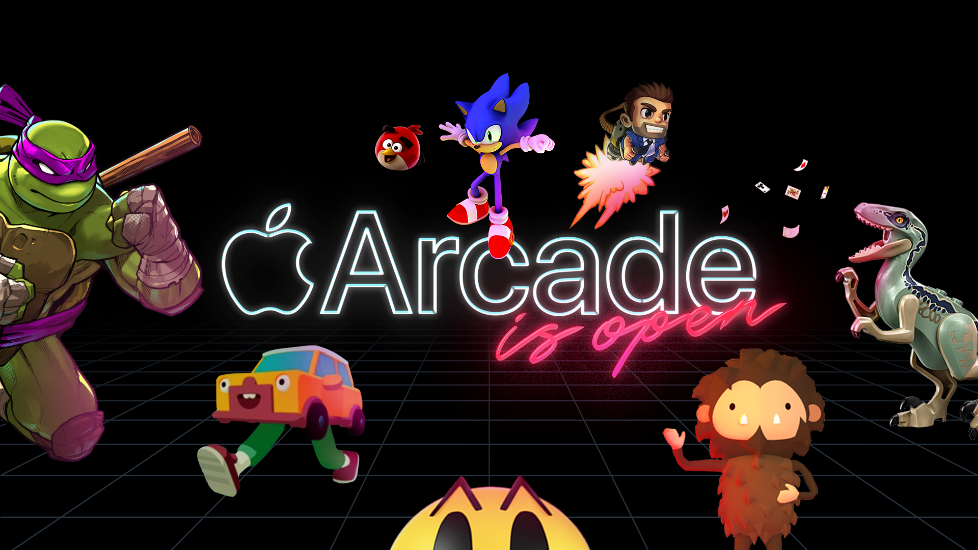
Final Utilization
The final design is now more versatile, and also retains the attitude of the initial vision. This version is now used in many applications, including web interactive, paid social, films and out of home placements, as well as localization for multiple global markets.
