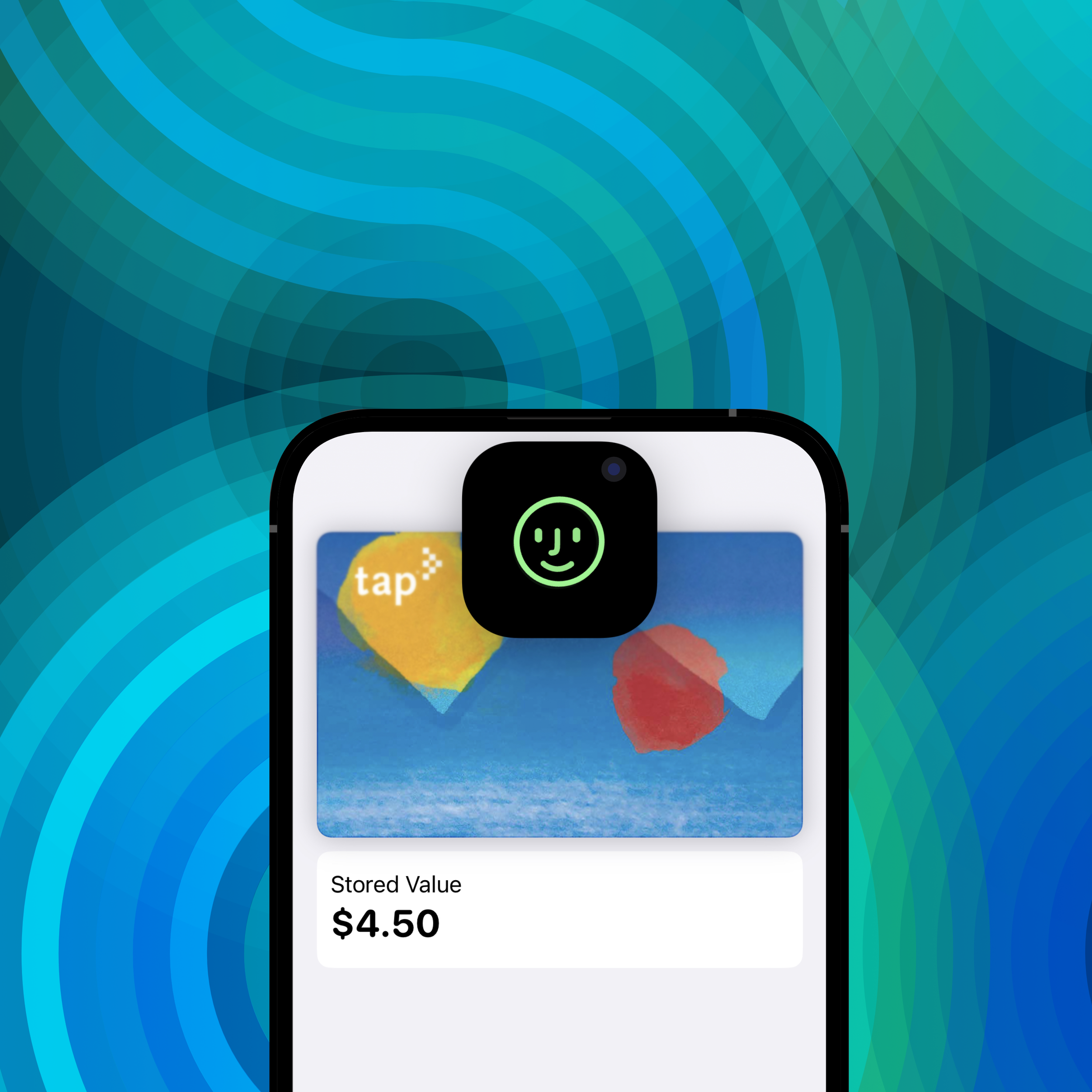
Pay the Apple Way
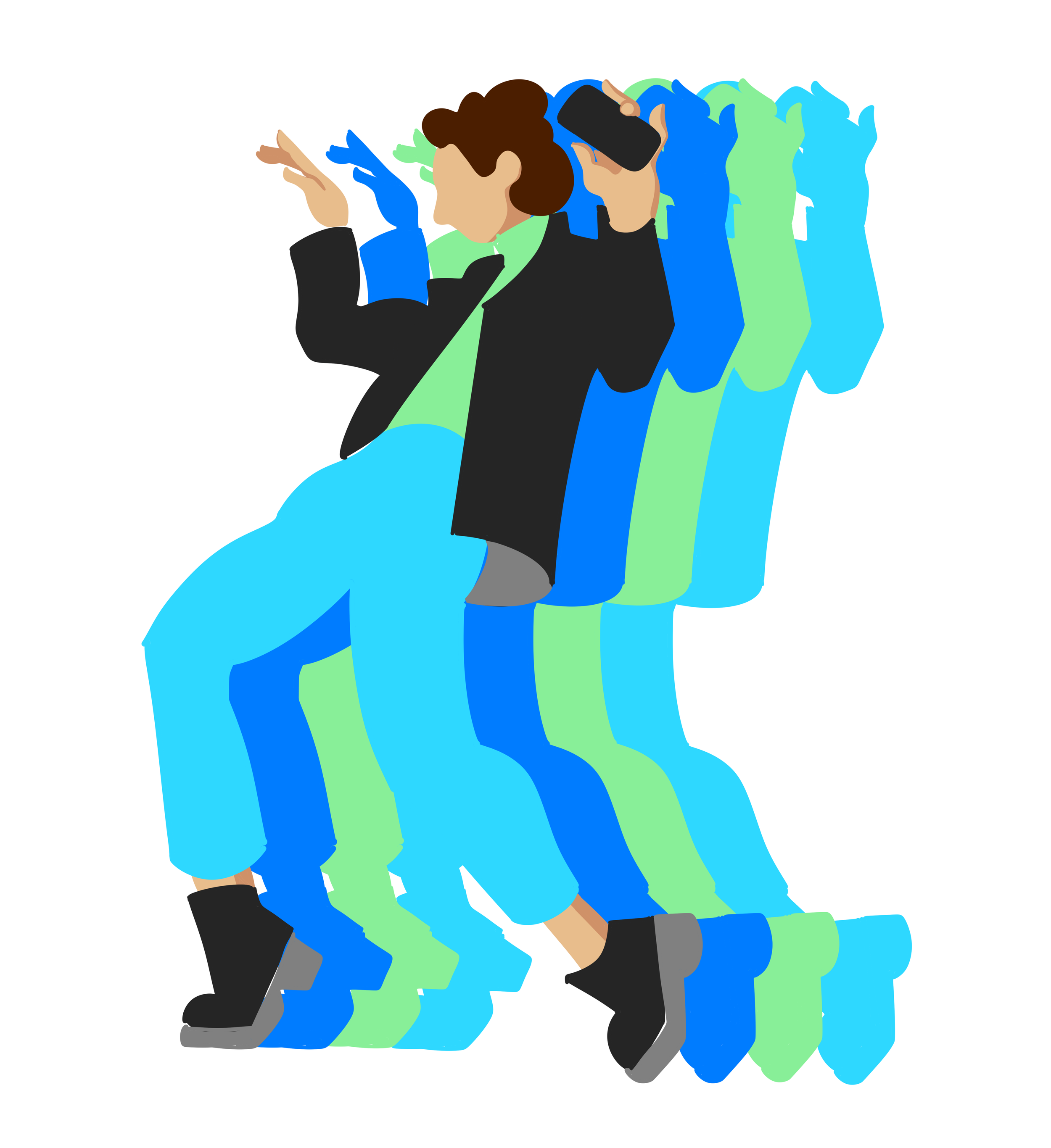
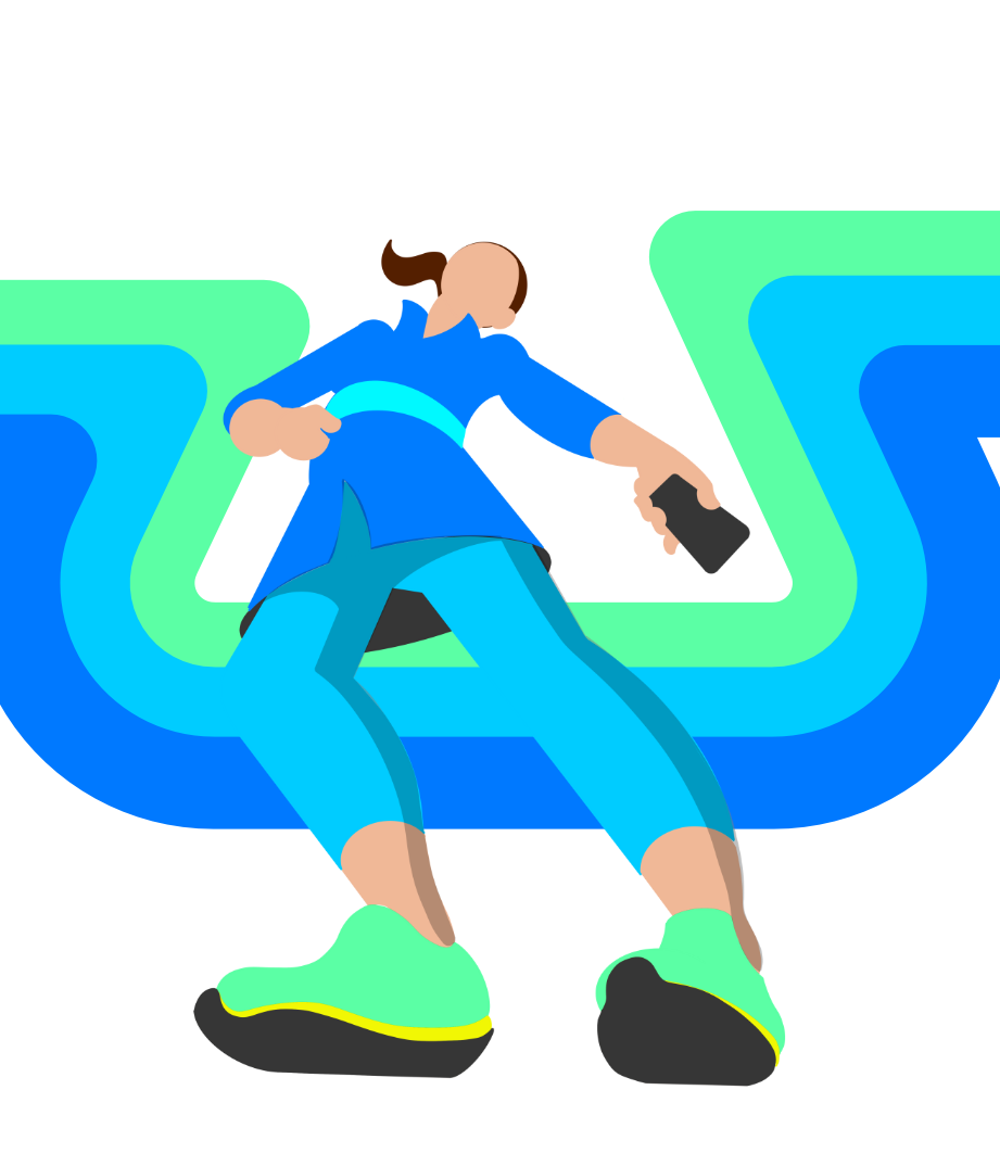
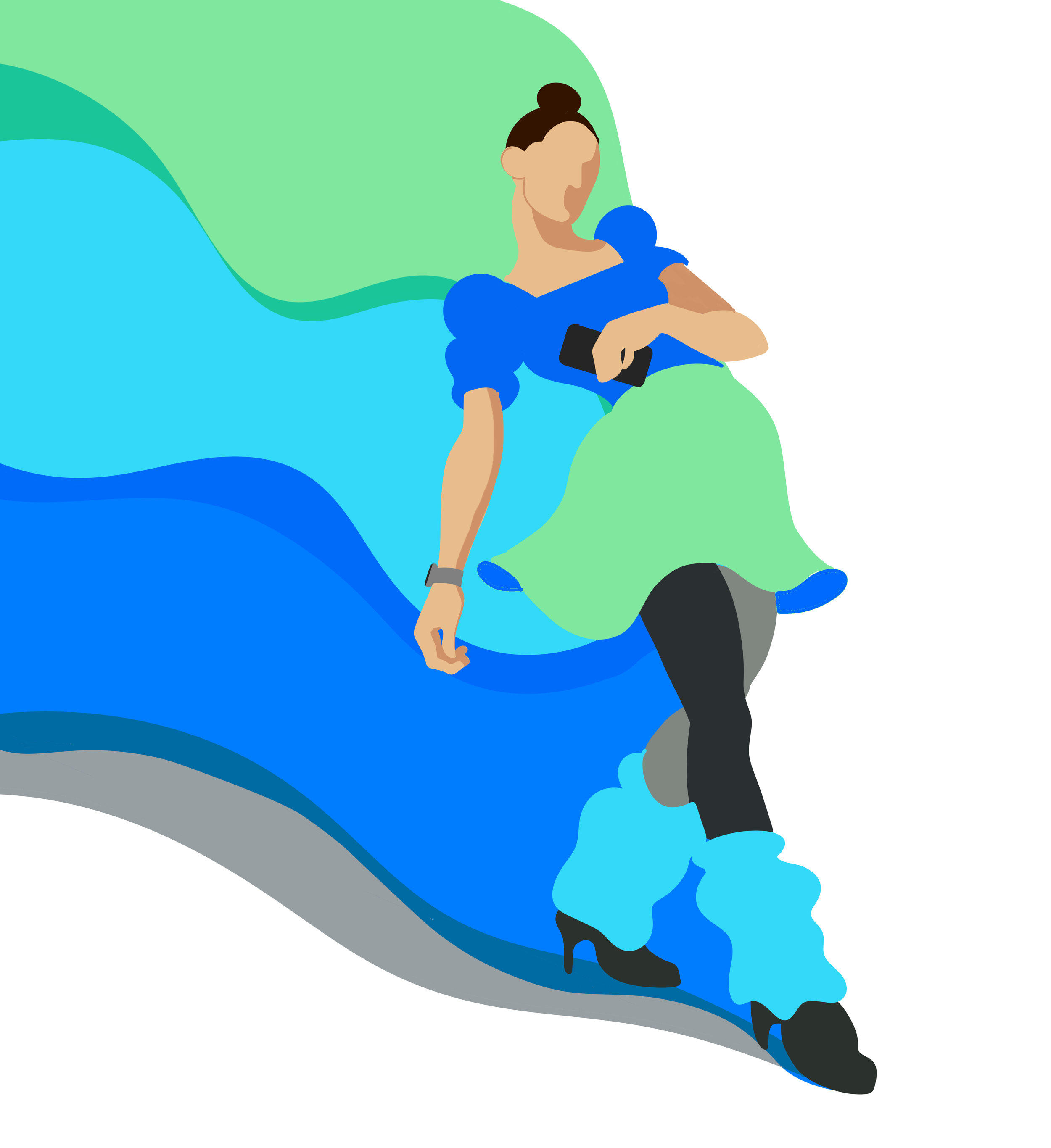
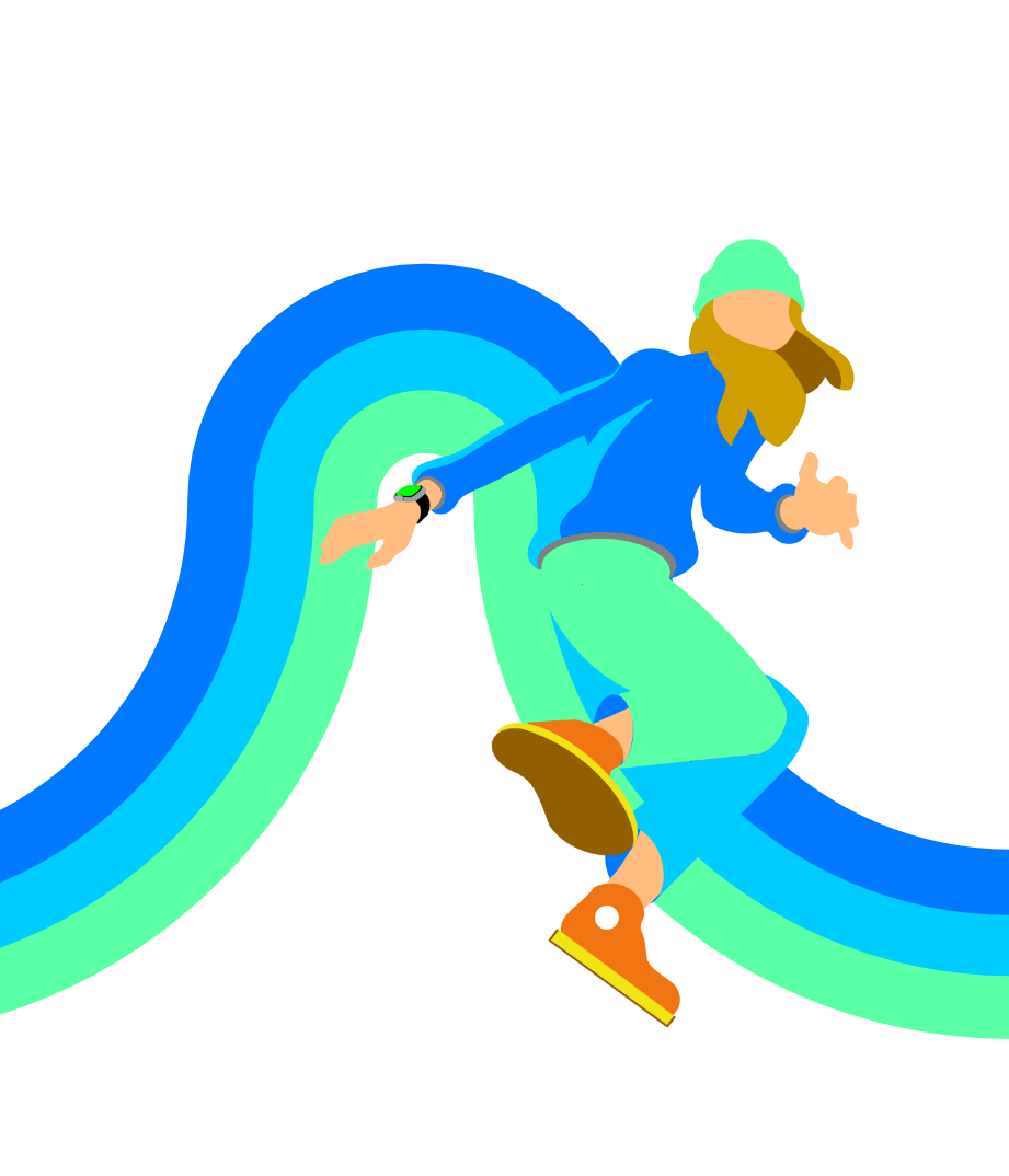
With the initial brief of the Fall Apple Pay campaign, the direction was simple, yet powerful: Paying never felt so good. We also knew pretty clearly where we were going with the color palette. So my initial designs leaned more into the illustrative, emotive, “flow” that paying with Apple Pay creates.
New Direction
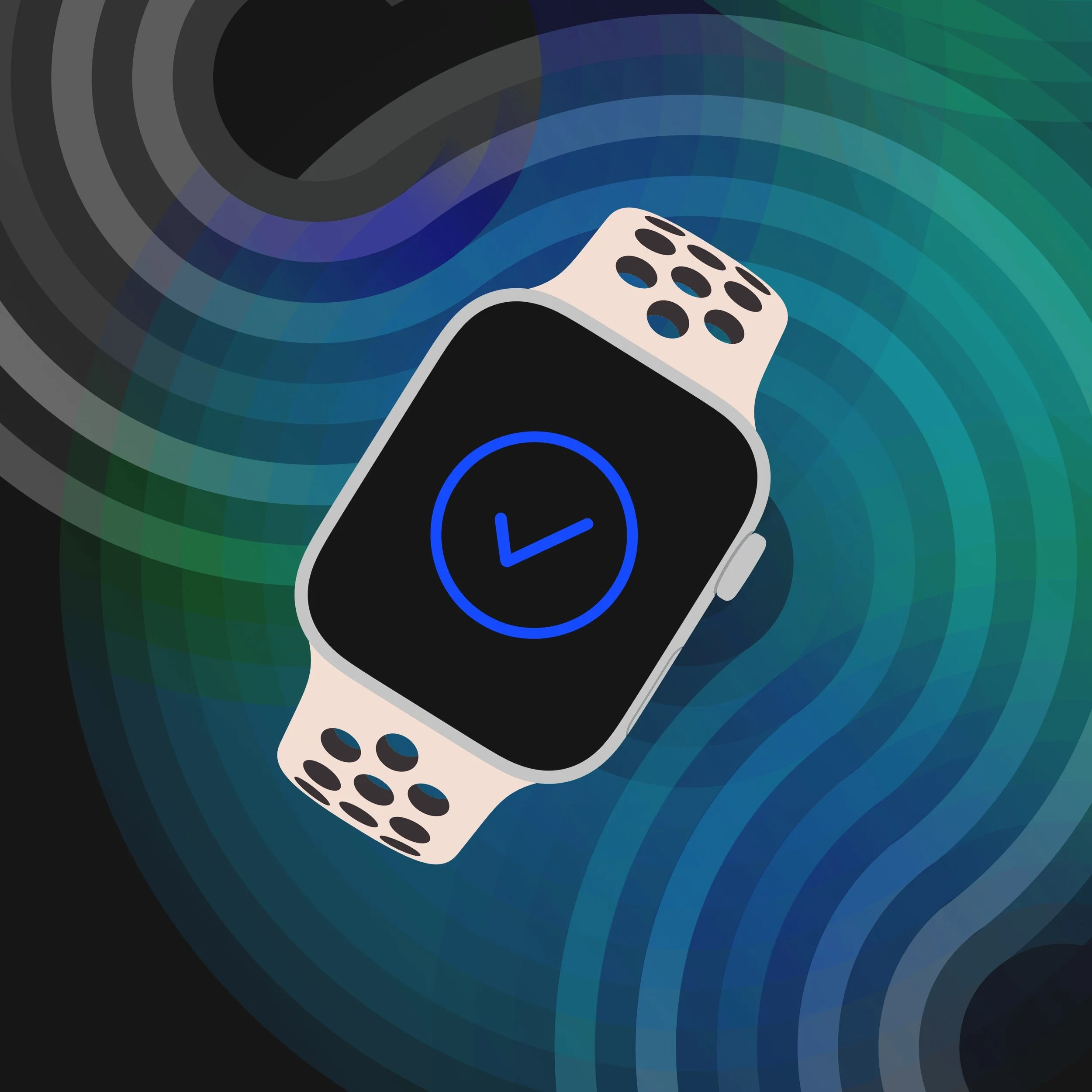
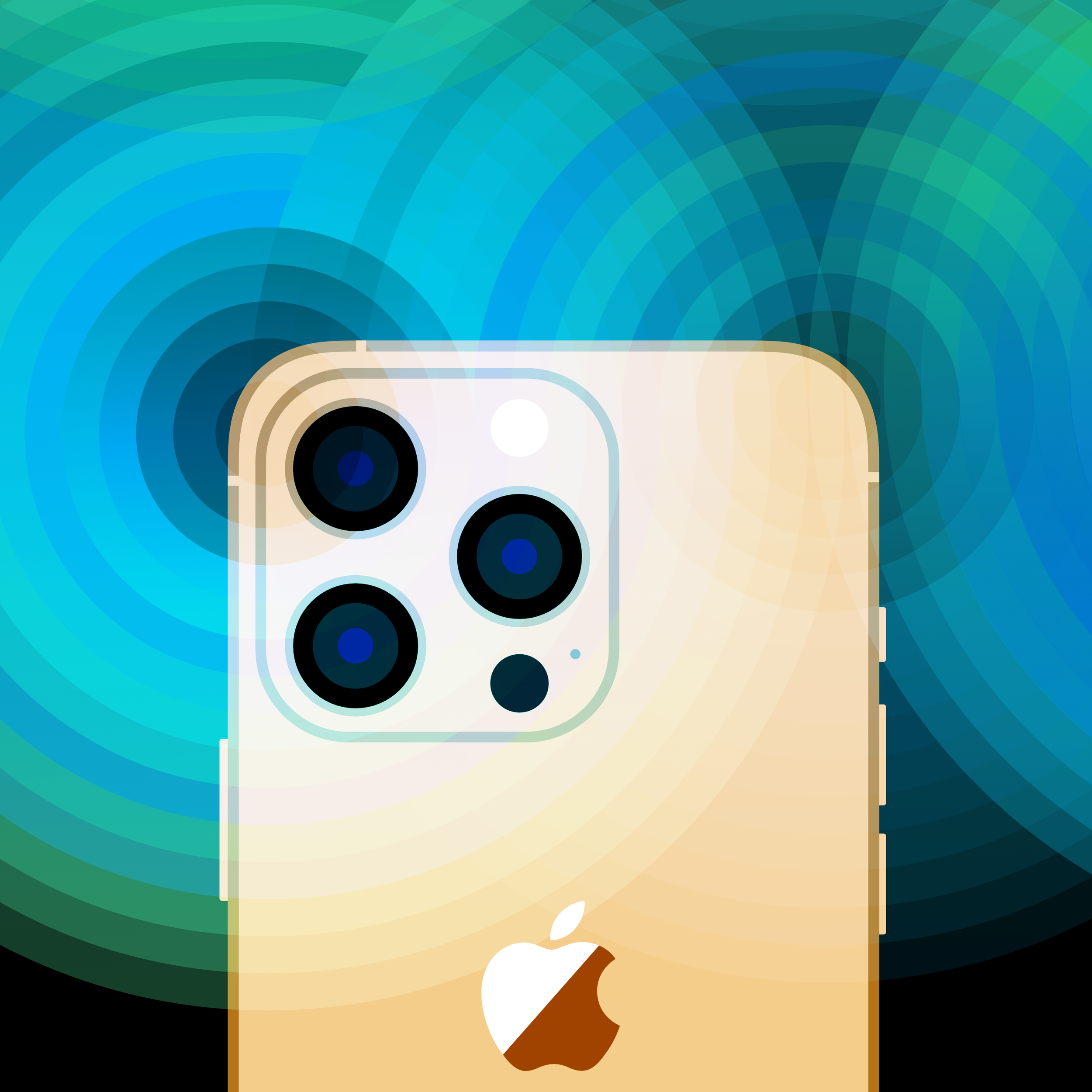
Eventually we determined that with the spirit of the futuristic simplicity that the devices offer, it would make more sense to focus on device interaction itself rather than characters, or dance-like emotions. The art direction moved more into the realm of device-centric.
Finding the Balance
With the new direction we didn’t want to lose the human element, so we can exploring ways that the design animation could emphasize the magically simple way of paying, while still retaining the feeling of the pay moment itself
Final Design
In the end…